Today Midjourney officially announced Niji 7.
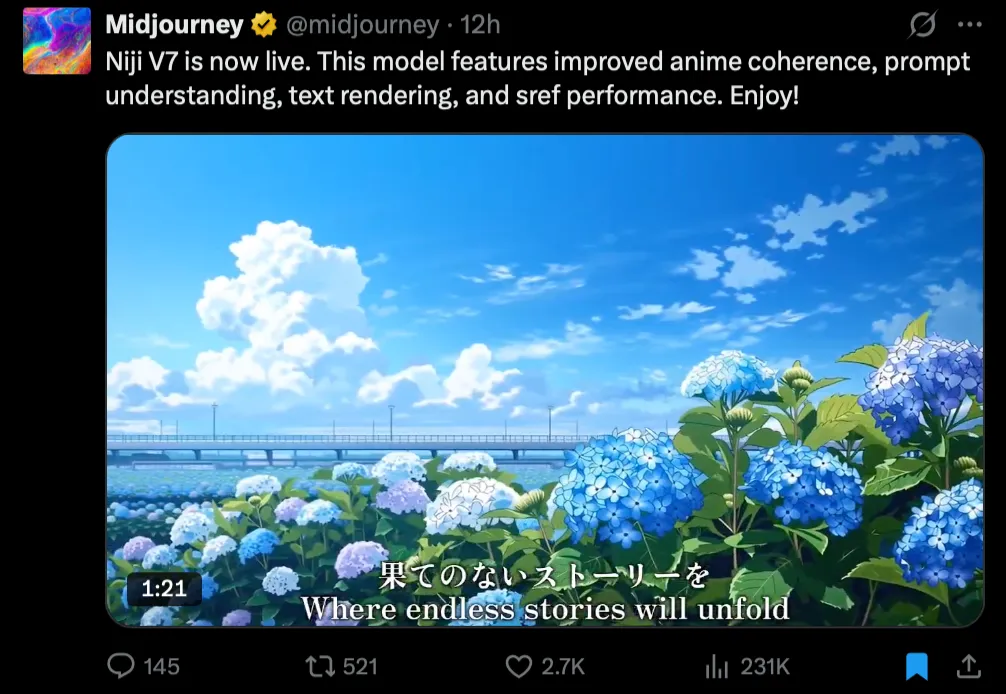
Midjourney has a V series and a Niji series (“niji” means rainbow in Japanese). The V models are general-purpose—you can draw almost anything. Niji is the anime-focused line.
They also dropped an animated promo, and it’s genuinely worth watching:
The biggest improvement this time is coherency. They call this part “Crystal Clarity.” Just look at this example:
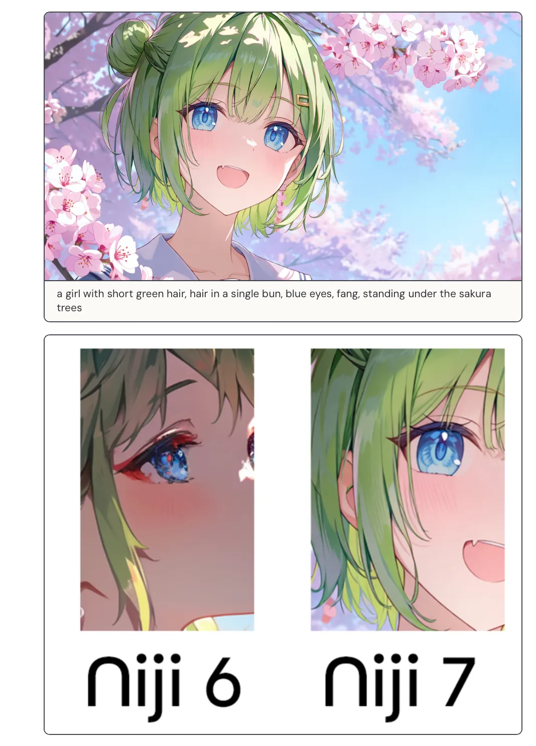
- Niji 7 (right): the catchlight, gradients, and reflection shapes in the iris are cleaner, and the layers read more clearly (what’s highlight, what’s iris texture, what’s shadow).
- Niji 6 (left): the iris details “smear together” more easily; highlights and texture blend into one muddy mass, and the edges get dirty faster.
Another big one is superior prompt following. Two examples below:
- Generate two cubes (left red, right blue).
- A girl with four hands (intentionally “four hands”), each holding an ice cream.
From the results, both follow the prompt quite literally.
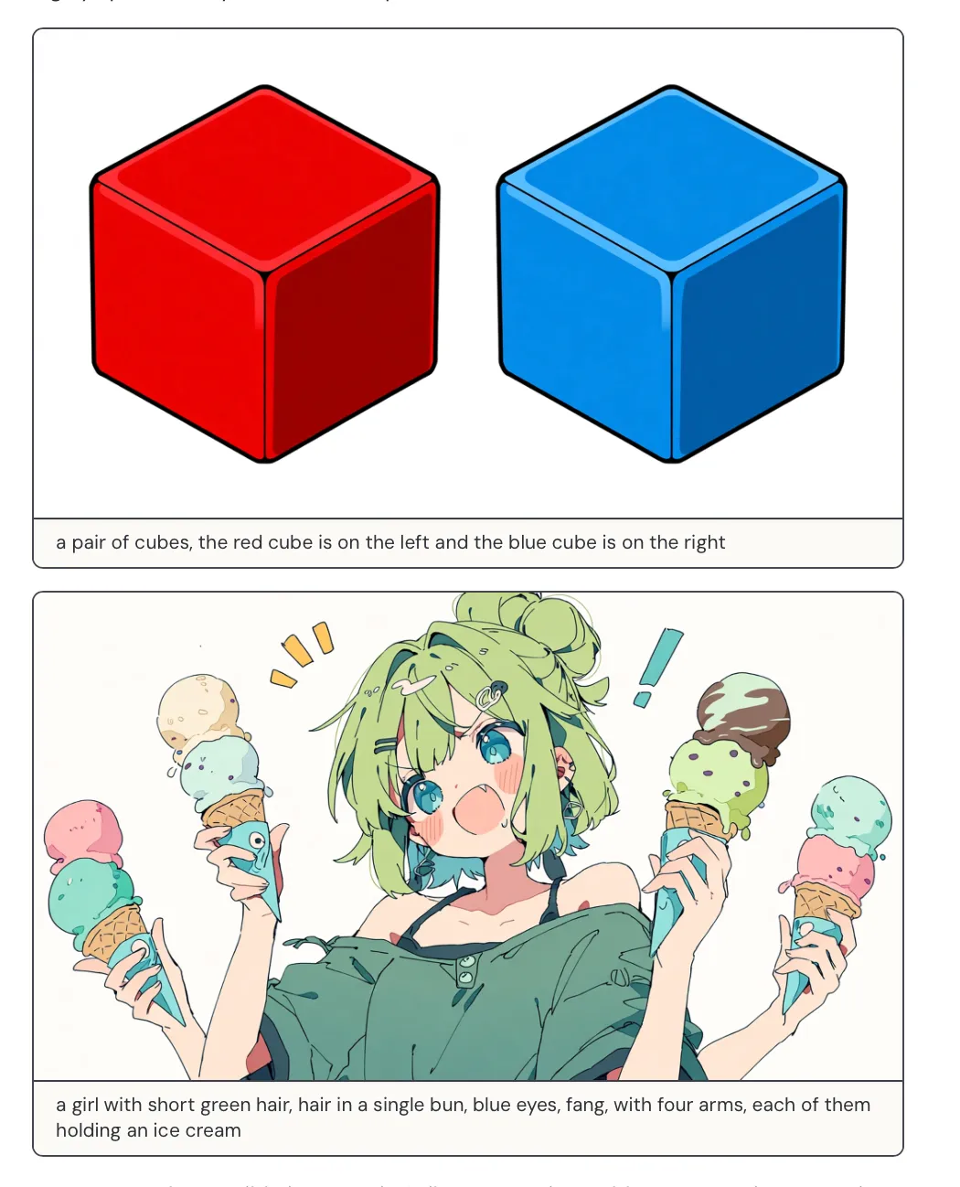
In the first example, the placement is strict: left/right, front/back, and even relative size are all where they “should” be, instead of randomly drifting.
One thing to call out: Midjourney isn’t doing LLM-style reasoning. So unlike Google’s Nanobanana (which can lean on Gemini to sanity-check intent), Midjourney can’t “reason first, then render.” It’s relying on the image model’s learned behavior. Nanobanana can achieve similar outcomes sometimes, but the technical path (and difficulty) is different.
The four-hands example is the same idea. It’s a pretty weird requirement, and a lot of models will fail in noisy ways (too few hands, too many hands, wrong hands holding things, objects disappearing). Now it’s more likely to execute the text as written.
But strict instruction following has a cost. I said it earlier: there’s no Gemini or GPT behind Midjourney. When it follows instructions, it’s not “because it reasoned it out,” it’s because the model has been tuned to comply. So ambiguity becomes your problem.
In their own words: this model is more literal.
Here’s the exact test prompt they used: anime screencap, a remote spring:
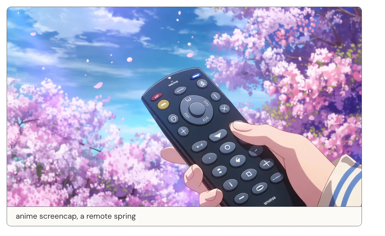
The ambiguity is that both words have multiple meanings:
- remote: a remote place / a remote control
- spring: spring (season) / a spring (coil) / a spring (water source)
What the user probably wanted was “a secluded source of water” (remote + spring = remote spring, as in a hidden spring).
But the model read it as “remote control in springtime” (remote control + spring season), so you get what you see: cherry blossoms + someone holding a remote.
The official note also hints that some old prompting habits may stop working as well as they used to, and they’ll publish a new guide.
The most interesting part to me is what they chose to explain. Compared to Google / OpenAI (who usually talk about model architecture and technical details), Midjourney went straight into an animation 101 lesson.
They argued that one of the most dominant aspects of anime is its overwhelming emphasis on line.
Animation is a sequence of frames. If every single frame is packed with full detail, it’s not realistic. So you simplify form with lines. The problem is: there’s nothing in nature which defines how to do it—lines only exist in the minds of people. That makes it one of the most difficult challenges they’ve tackled (“That makes it one of the most difficult challenges we have tackled thus far.”).
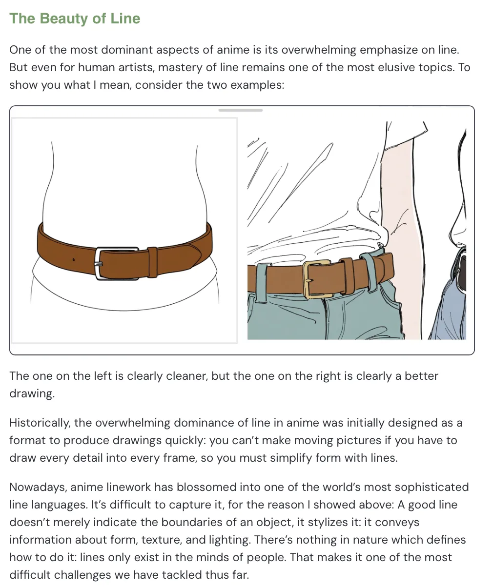
In the left image, there are fewer lines: clean, simple, and readable. On the right, there are more lines, and you start seeing detail like how a belt presses into fabric, and how the fabric folds.
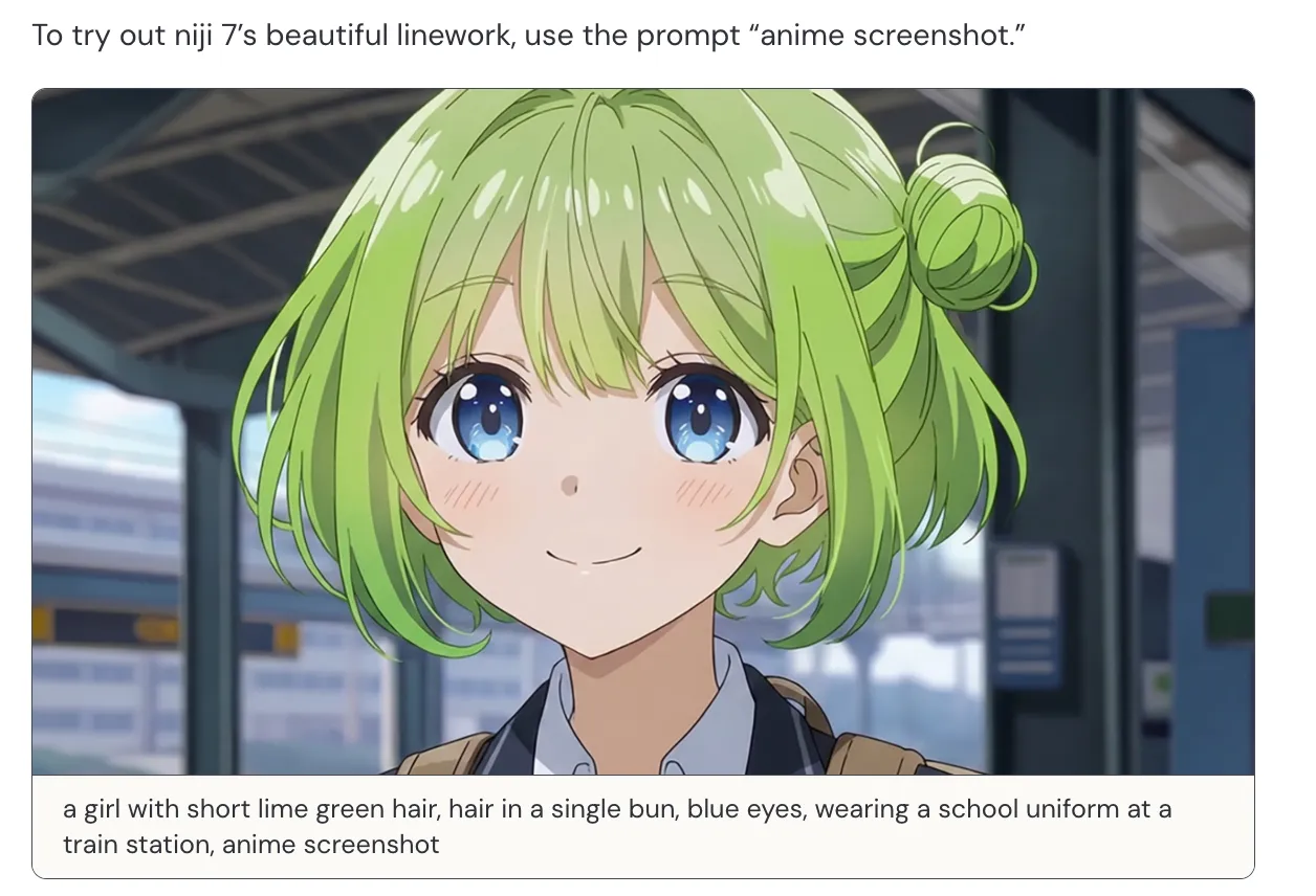
Now if you just add “anime screenshot” to your prompt, you get linework that lands pretty much instantly. (Below I’ll also share some community examples.)
Here’s a more technical note that’s kind of counterintuitive: AI elements probabilistically fail, and simple drawings have very few elements—so images with more “stuff” are sometimes easier than images with fewer elements.
In the comparison below, the first one is a 3D-ish style and looks more complex than the second. But the second one is actually harder:
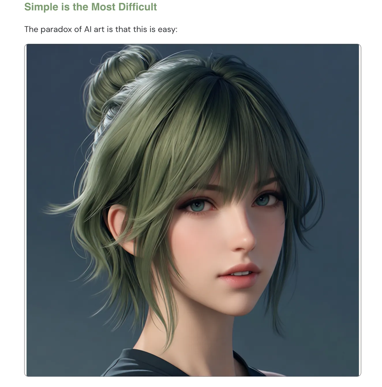
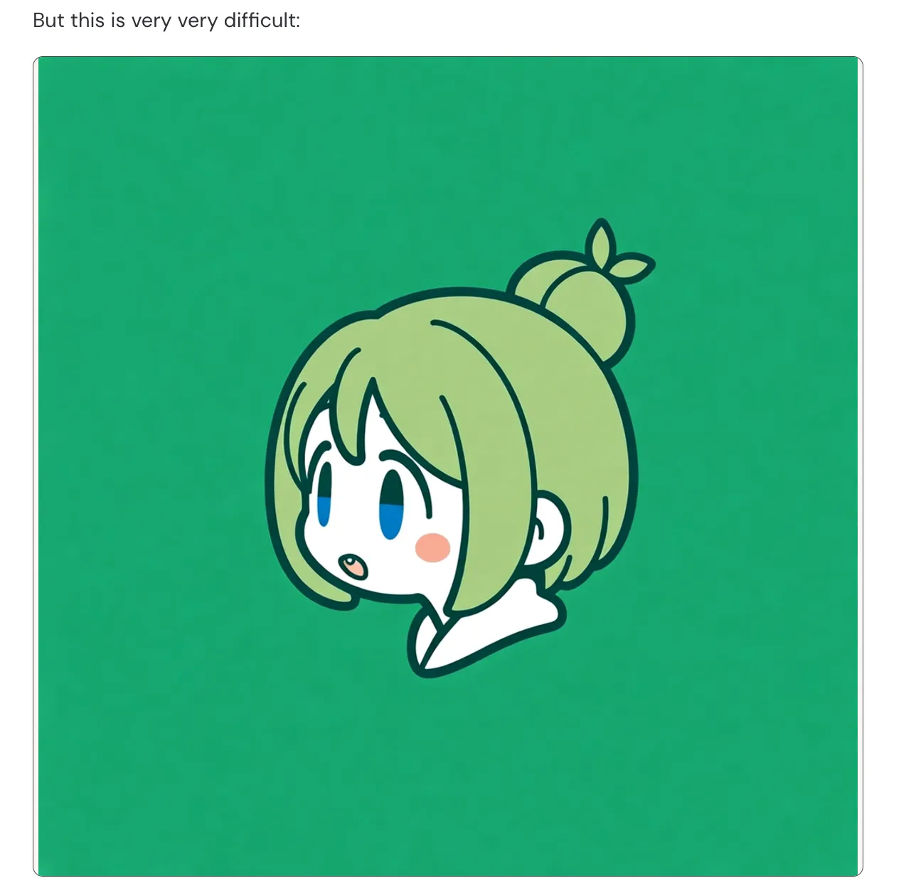
Randomness means errors will happen; that’s the current limit of the tech.
If an image has only 4 elements and 1 fails, the whole image is ruined. To hedge against that probability, making an image with 1000 elements can be easier: if 1 fails, you still have 999 working, and your brain will still accept it as “good.”
With fewer elements, every tiny error becomes obvious—there’s nothing else to hide behind. Minimalism is harder. It demands stronger structural consistency, better line control, and better control of negative space.
Midjourney basically said: we know this risk, and we still tuned for simplicity instead of hiding behind over-rendered detail:
Simple drawings require large areas of emptiness. And emptiness is scary: less elements overall means less elements to hide mistakes behind. We consciously tuned for simplicity, despite knowing this risk.
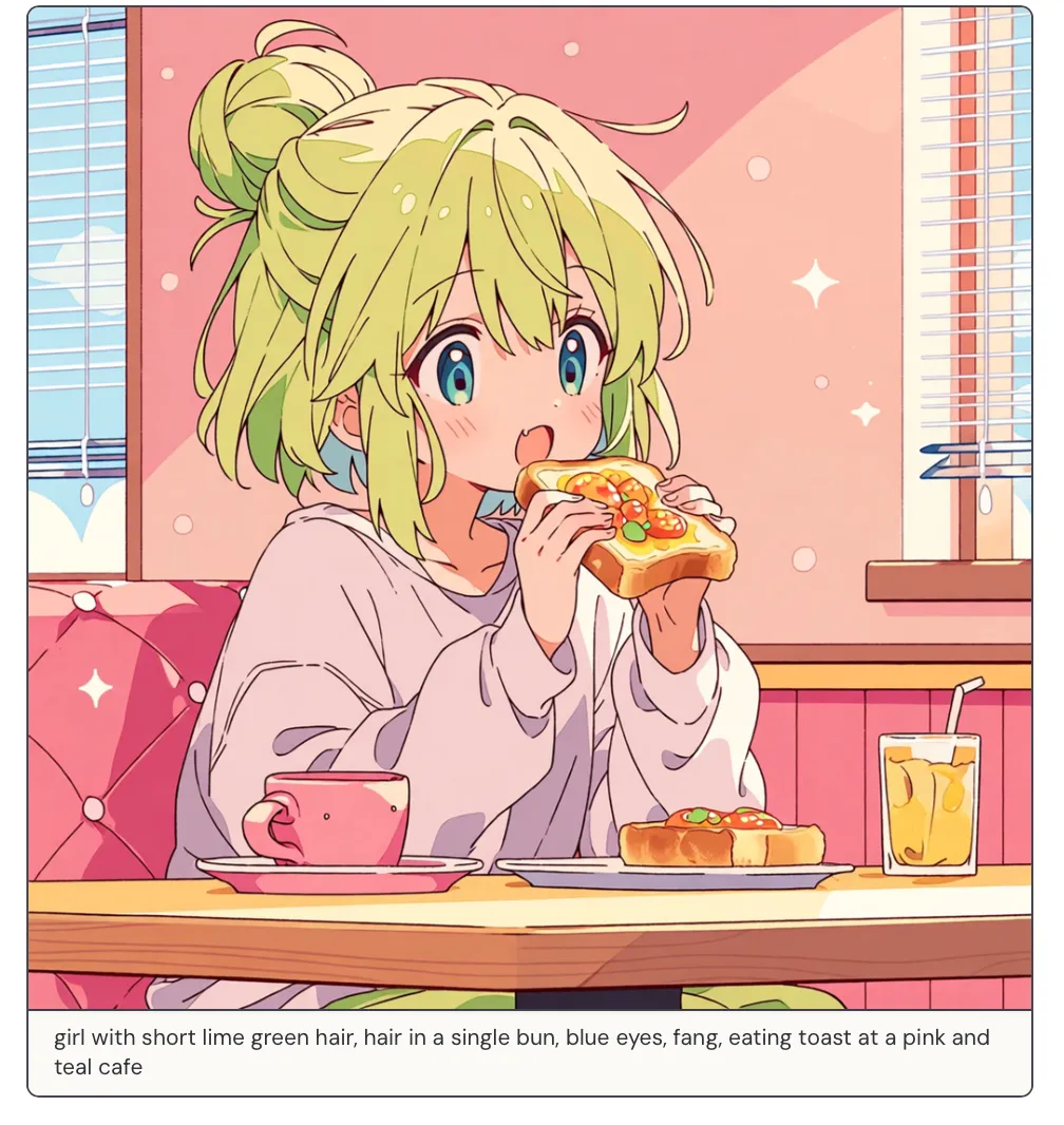
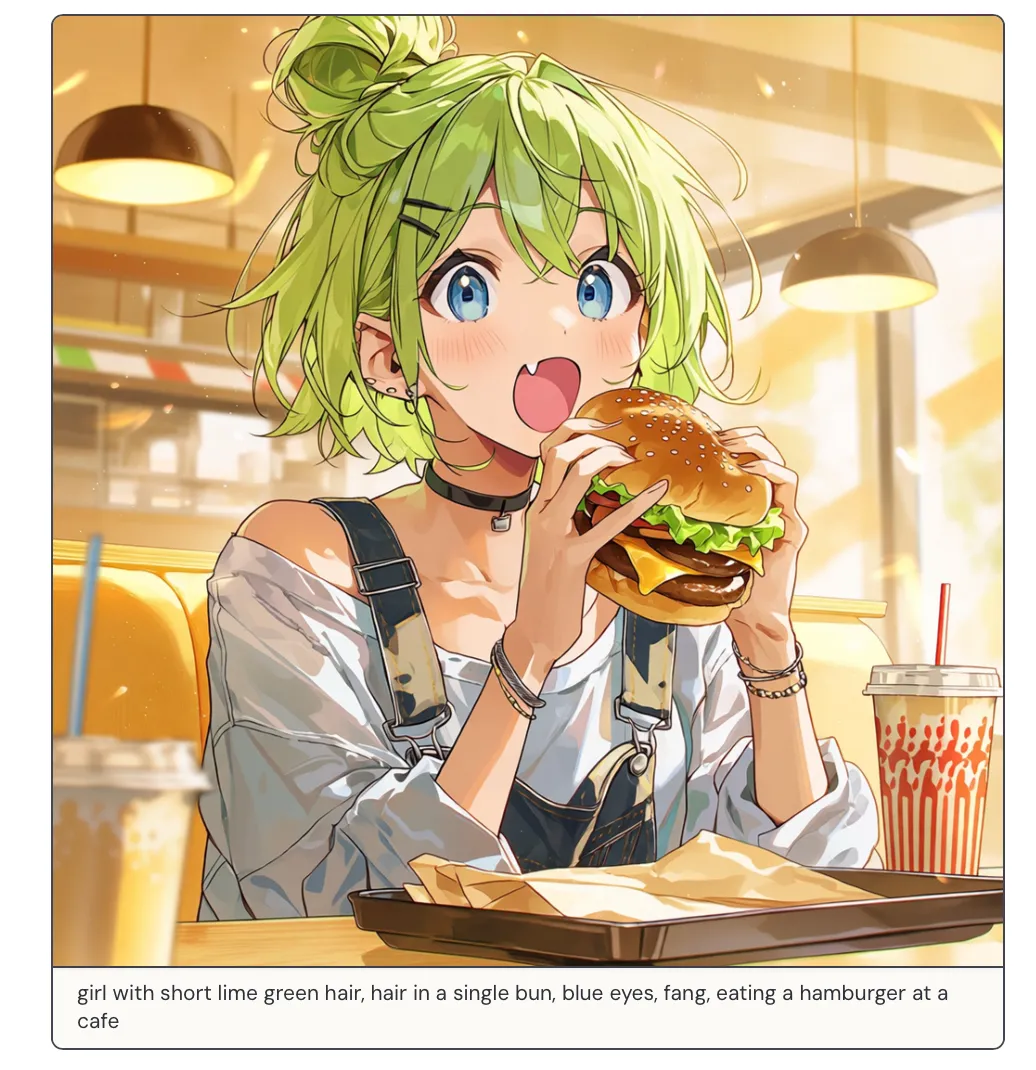
They toned down the amount of rendering in the default style (you can think of it as 3D-ness) so you can feel the fidelity of these improvements.
Toast scene: flatter shading, steadier lines, cleaner big shapes.
Burger scene: more “light,” but still emphasizes stable structure instead of going overly 3D.
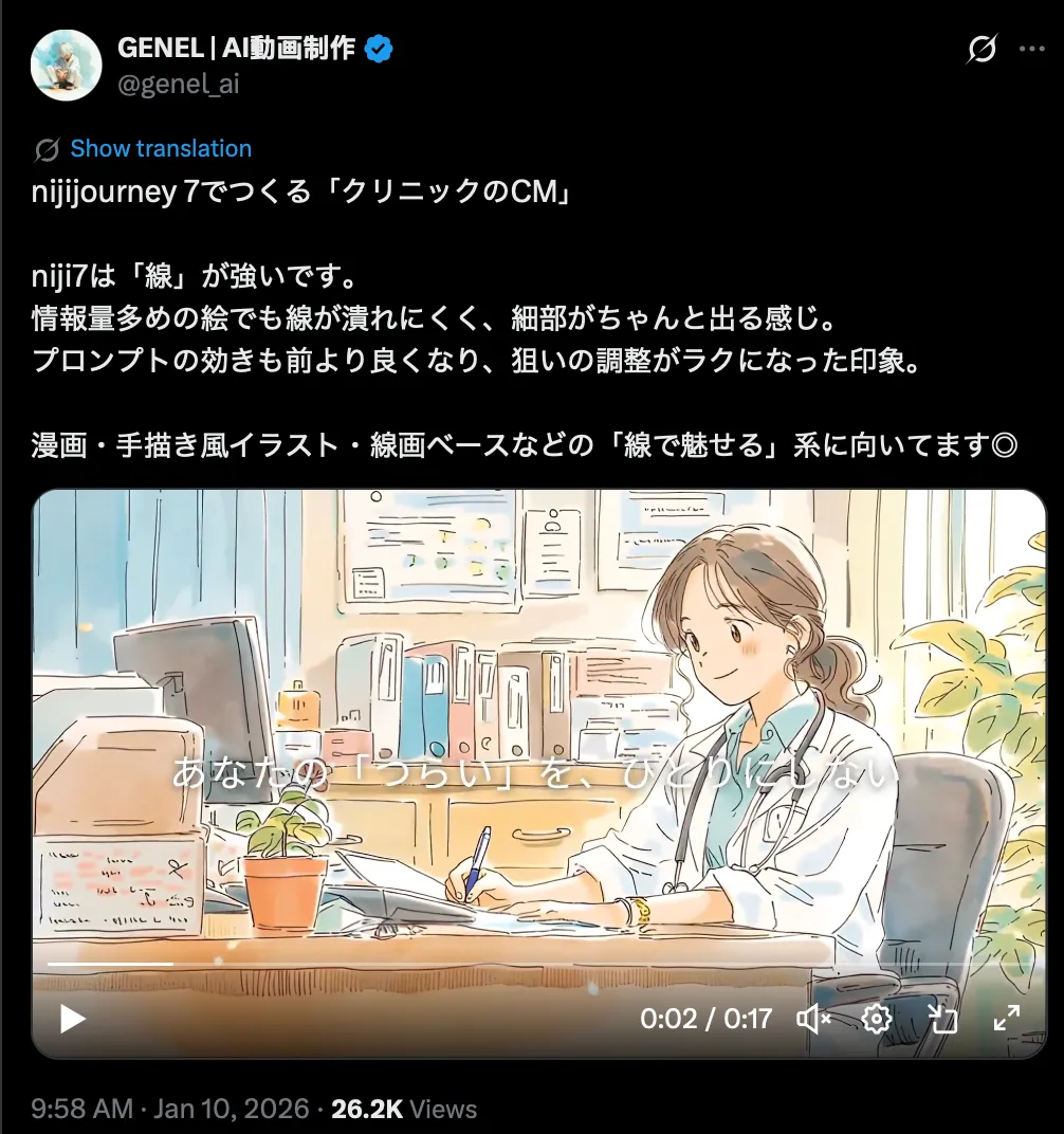
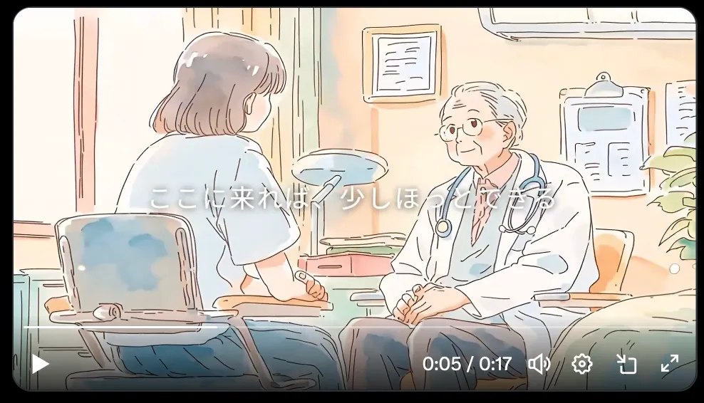
Now I’ll share a few works I saw on X.
The first one is a hospital CM-style animation. It’s already commercial-grade, and people made this not long after release. Personally, I think it’s getting hard to argue where the “hand-drawn” line is anymore.

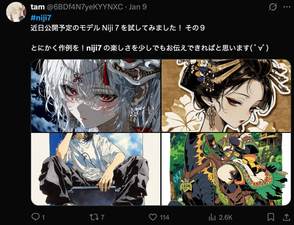
Some more favorites—if you like them, just search around and you’ll find the threads.

Last, two things.
First: I wrote a post before criticizing Midjourney and saying it wasn’t worth $30/month. I owe them an apology.
https://www.kuroneko-cmd.dev/posts/2025/is-midjourney-worth-30-per-month/
But now my view is: it’s worth it, and it’s also not worth it.
Midjourney’s aesthetics are still king in image generation. And the path they’re taking is fundamentally different from Google / OpenAI. The team clearly has deep taste and real art instincts; otherwise they wouldn’t obsess over something as “small” as linework. If they keep pushing in this direction, I don’t think OpenAI or Google will necessarily swallow the slice of the market that Midjourney uniquely owns.
Also, my bias is that OpenAI / Google / Grok are racing on the LLM itself—generality, reasoning, tooling—and that doesn’t naturally force them to compete on pure aesthetics.
The flip side is: without LLM-style reasoning, prompting Midjourney is harder—especially in Niji 7. There’s less room for vague intent, and English prompts matter. If you’re just playing around, it’s fine. If you’re producing game assets or serious content, you need real craft, iteration, and you need to get good at things like --sref (Niji 7 doesn’t support --cref—the official post teases a “super special secret surprise” they think you’ll love more than the old --cref).